In today’s age of technology, your users look at your website to decide if you are a business they want to work with. Your business is judged on your website, so making sure it is user-friendly is paramount to the success of your business.
The term “user-friendly” means your website is easy for your audience to utilize. Your users should be able to easily understand and navigate your site to find what they need. Your site is a representation of your business to potential clients, so it must be “friendly” to its users.
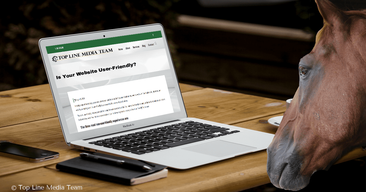
The three most non-user-friendly experiences are:
- A hard-to-navigate website: We have all struggled to find what we are looking for on a website. It is frustrating, and, after a few seconds, we often decide to go to another site for the information we need. For example, you may want to donate to your local therapeutic horse riding faculty, but have difficulty finding the donate page. Similarly, you could be looking for a page that has details about an upcoming event with your local horse chapter, but that section is not easily found.
- A slooooooow loading time: You know what I’m talking about. You need to get a new performance helmet, so you do a Google search for “Troxel Spirit Performance Helmet” to see which carrier has the best deal. You click on the first link and the website starts to open, but then you see “the wheel of death” spinning around. 2 seconds…5 seconds…8 seconds…12 seconds… and then you return to the Google page and click on the next link.
- Not easily accessible on mobile devices: You go to a website on a desktop and it is very user-friendly. You can see the images, read the text, find the links, and it is very pleasing and easy to navigate. Then you pull the same website up on your phone and it is an entirely different story. Images are to small to see, the words are going off the screen, the links are not working, and so much more.
These user experiences are common complaints and you will even catch yourself judging other websites on these functions without thinking about it. Have you reviewed your site for these top three violators? If you have not, this should be your first step in checking your website.
Let’s look at some different ways your website could be deterring your audience from turning into your clients. We are going to break down the user experience into several common attributes found in user-friendly interfaces.
Accessibility
- Avoid a slow load-time. Users want everything promptly.
- Stick to the basics when setting up text and background color. Classic black/dark text on white/light background works best for eyes.
- Use the right size font and white space.
- Utilize a custom 404 page to guide your users back to the content they are looking for on your site
Identity
- Have your logo placed where users can see it. For example, you could put in the upper left corner or middle of the top of home page.
- Make sure users know what your business is all about with a quick look on your home-page. Remember, they want everything promptly.
- Use your tagline to describe what you do in few words.
- Make sure there is a clear path to your company’s information and contact page.
Navigation
- Have your main navigation easy to find, read, and use.
- Keep the navigation words short and sweet. For instance, use “Our Work” instead of “See All Of The Work We Have Done.”
- Link your logo to your home page.
- Ensure that links are easily identifiable and remain consistent throughout the site.
Content
- Place the most important content above the fold on your website (i.e. the cut off point on your screen that shows only the top half of your site).
- Keep content organized and clean with appropriate use of headings and use of color and styles consistent.
- Have the main copy direct and to the point; cut out any extra words.
- Have your URLS set to be descriptors of what is on the page and not generic. For example, our blog post about Rosinburg Events LLC has a URL of https://toplinemediateam.com/rosinburg-events-llc/. Right away you know what you will be reading about. If the URL were https://toplinemediateam.com/blog-post-22/, who knows what it is about.
Basically, you need to make sure your website is straightforward with quick access to common features so your users can find what they are looking for with minimal explanation on how to use your website. Look over your website using these tips as a guide to make sure your website is user-friendly. If you find some places that need improvement, let us know if we can help. After all, we offer concierge online services for the equestrian marketplace.